When starting a nonprofit or breathing new life into an existing nonprofit, choosing the right colors is a great first step. A consistent and professional look can create a sense of credibility between your nonprofit and potential volunteers, advocates and donors. Done correctly, these colors should be used repeatedly, whether it’s in your logo, on a t-shirt, in a social media post, or anywhere else, so it’s important to choose colors that represent your nonprofit and its mission.
Brand colors often include the color(s) in your logo, as well as a few accent colors, to ensure visual interest. The best colors for your nonprofit depend on your mission and the location of your organization. While the study of color psychology is well known, people often don’t consider how color is used by other nonprofit organizations. We’ll examine plenty of examples below, but be sure to reach out to us if you’d like the help of one of our expert marketers in selecting brand colors, creating a logo, or designing a great website for your nonprofit.
Pink in Nonprofit Branding
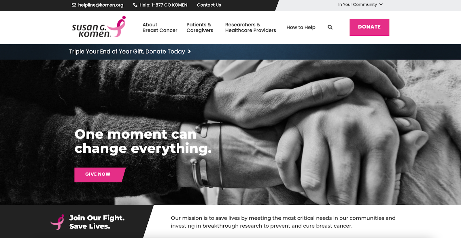
In the nonprofit world, pink has become synonymous with organizations that prevent, research, and assist those with breast cancer. It’s largely thought that Susan G. Komen Breast Cancer Foundation was a major factor in this, as their branding is pink and they were the first to use the pink ribbon as a symbol for the cause. You can see on their homepage they often use black, white, and gray with the hot pink as an accent to draw attention to certain things. This is a common practice with bold colors like hot pink, vibrant purple or yellow.
In many Western cultures, pink is associated with love and femininity, so the association with breast cancer (and sometimes other cancers that largely impact women, like ovarian cancer) makes sense. But keep in mind, some Eastern cultures view pink as a masculine color. Pink might be right for your nonprofit if your cause is related to women in the US or Canada, but it might be the wrong choice for a nonprofit working with women in Japan.
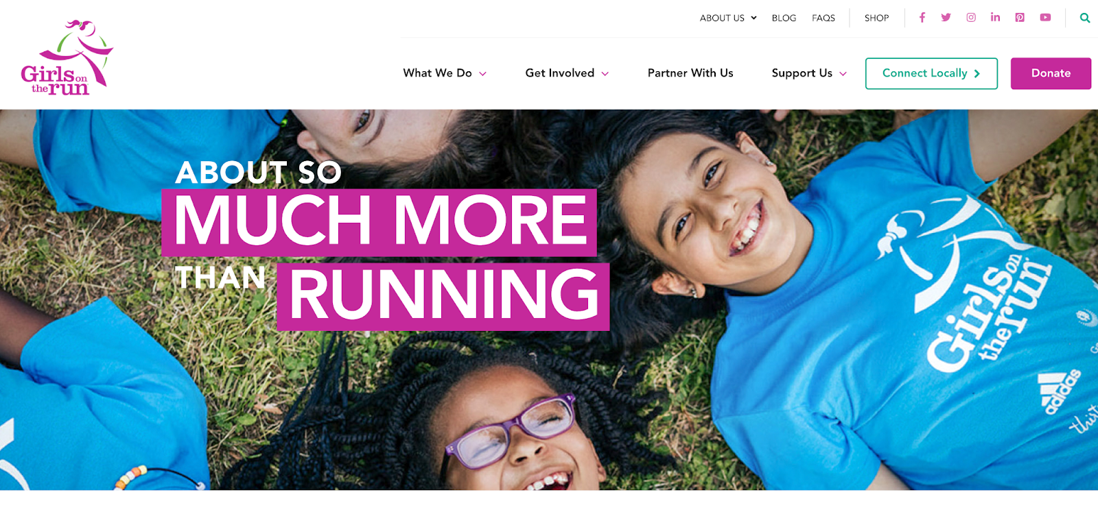
Pink is an energetic hue, so it can also be appropriate for organizations that have to do with exercise. Girls on the Run uses a magenta shade to evoke energy and optimism.
Red in Nonprofit Branding
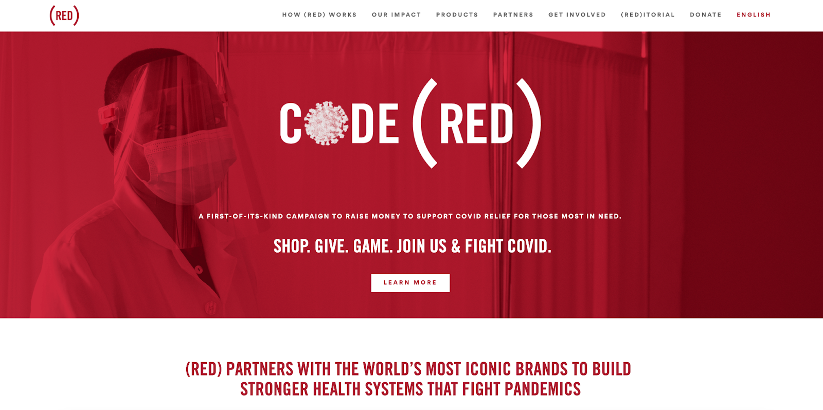
Red is a bold choice, often used for organizations dealing with emergencies of some kind. Medical nonprofits like (RED) and nonprofits that aid in disaster relief like The American Red Cross use red because their causes are urgent, emergency situations. Red can conjure images of sirens like an ambulance or a stop sign. Organizations like D.A.R.E., a nonprofit that educates students about the dangers of substance abuse, use red frequently as a warning or a “red light” against dangers.
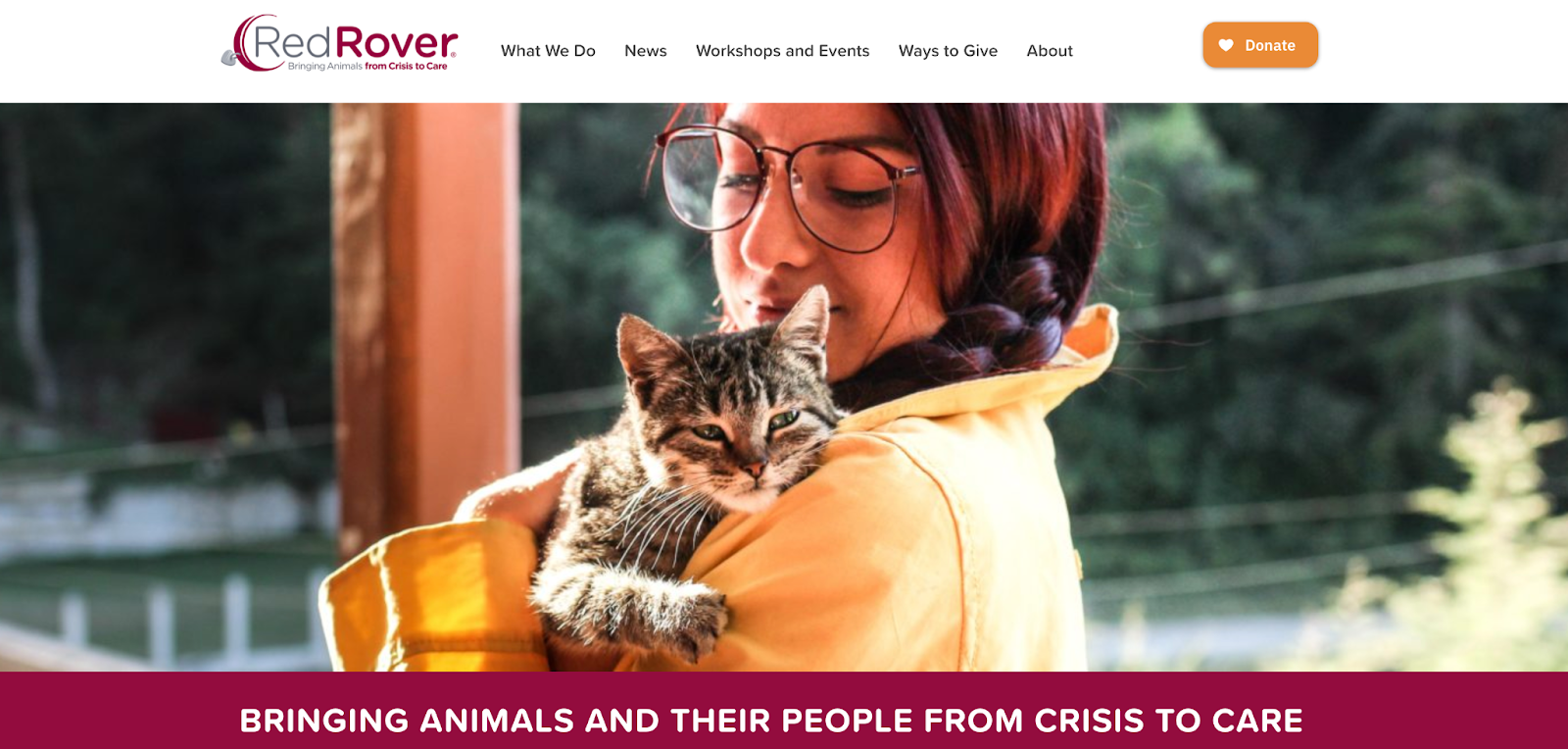
But red can also be used as a symbol of love and caring, thus it is used by a wide array of charities from animal rescues to kids’ causes. You’ll see Red Rover’s red is deeper, closer to a burgundy color, which prevents it from looking like the vibrant, emergency red of the previous examples.
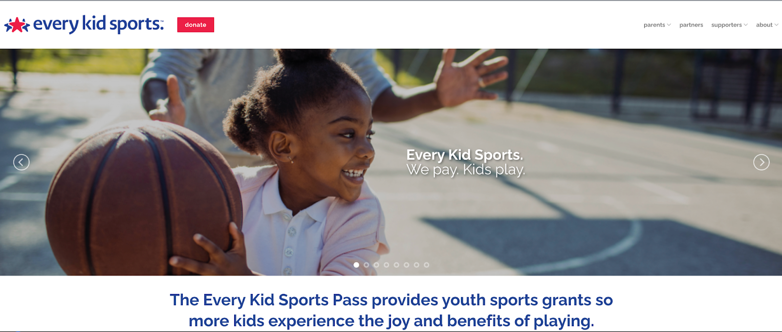
Other nonprofits use red as an accent color, along with a softer color. Every Kid Sports is a great example of this. They use a bright, kid-friendly red, paired with a dark blue. The red acts as a pop of color when emphasis is needed, whereas the blue can be used more universally without overwhelming the viewer.
Orange & Yellow in Nonprofit Branding
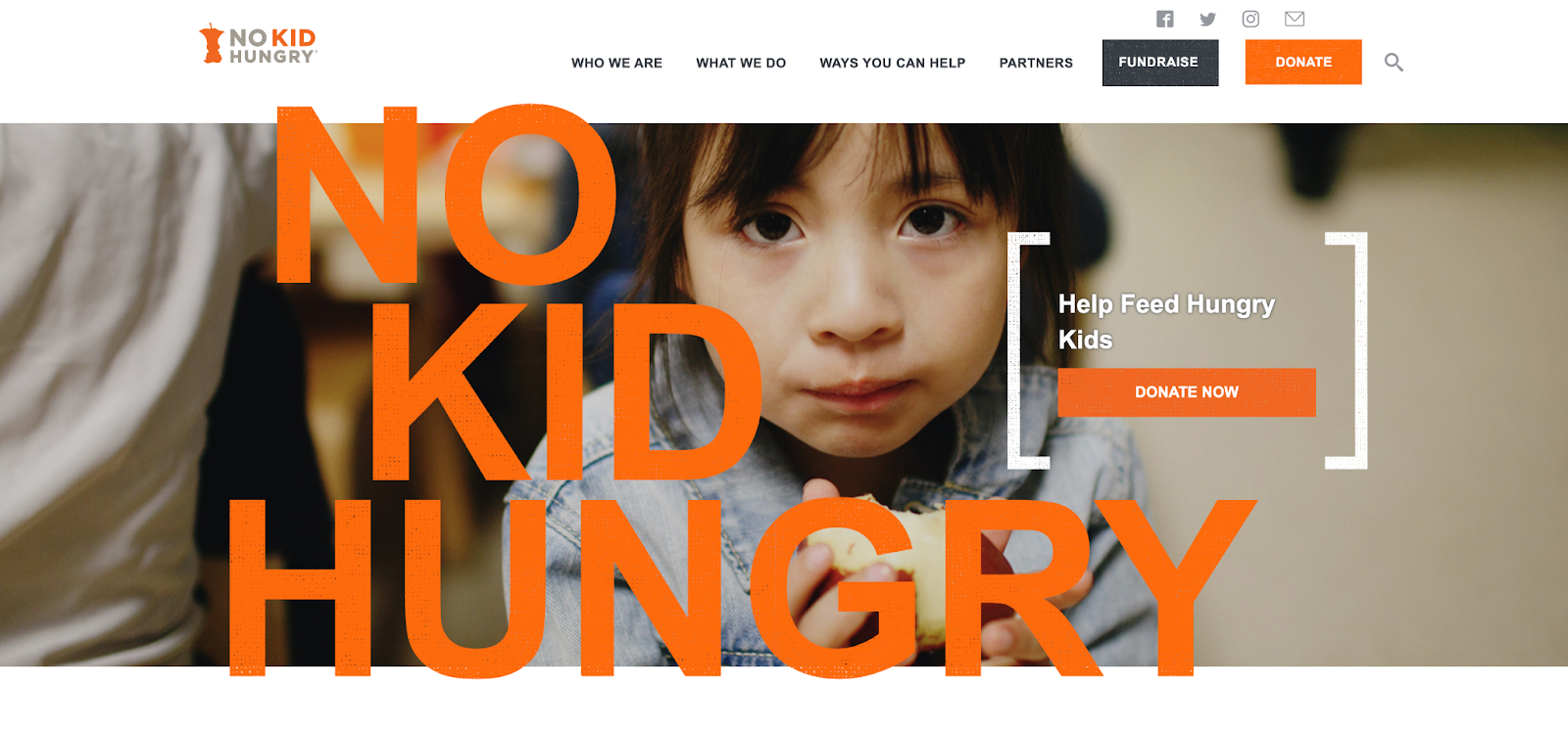
We’ve grouped together orange and yellow as they’re often used similarly in the nonprofit world. Oranges, golds, and yellows are all frequently used by organizations that aid in hunger relief, whether it’s golden wheat in a logo or a brown lunch bag. No Kid Hungry uses orange to make a statement, catching the viewer’s eye without conjuring images of emergency sirens like red. Orange is also used by some arts organizations to stand out from the crowd. While plenty of organizations use blues and reds, orange and yellow are less common choices.
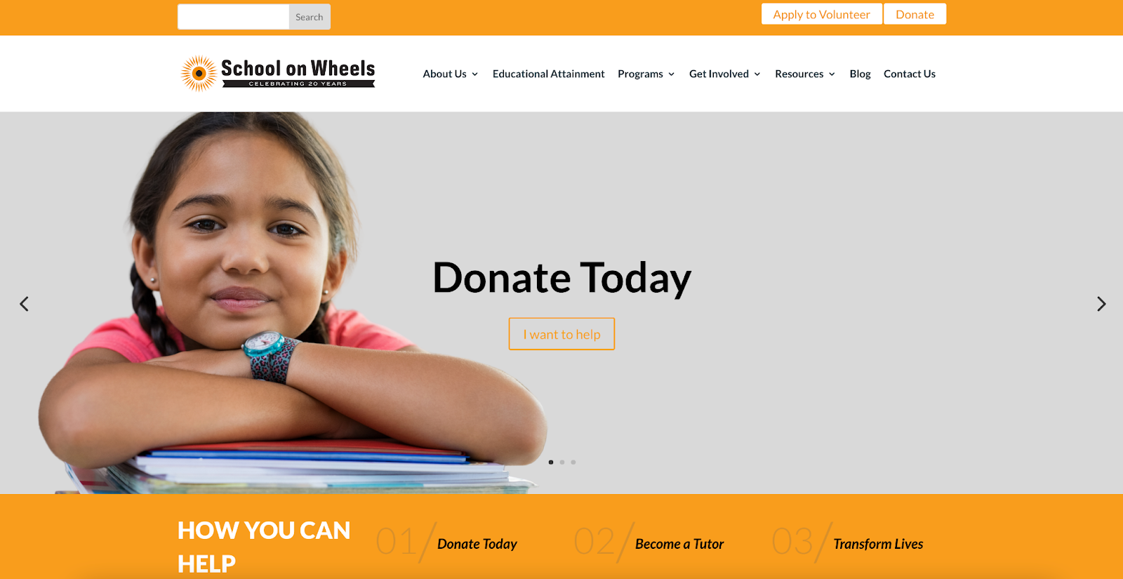
Education-related nonprofits also use golds and yellows frequently, as some shades remind viewers of pencils or school buses. School on Wheels uses this association with their signature school bus orange. A bright orange or yellow can also elicit optimism or innovation, useful for nonprofits of all kinds.
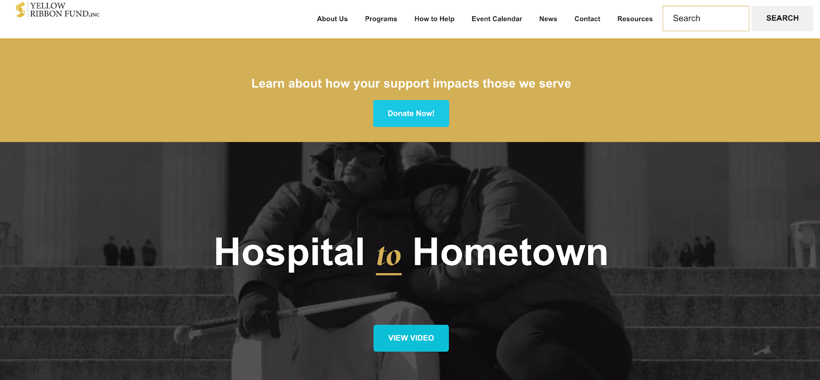
Yellow is also used frequently in veterans organizations like Yellow Ribbon Fund. Yellow Ribbon Fund uses a more golden shade to match the seriousness of their cause– providing help to ill and injured service members and their families. A brighter yellow has also been used by suicide prevention organizations or human rights organizations as a symbol of hope, often used with a symbol like a sun or candlelight.
Green and Teal in Nonprofit Branding
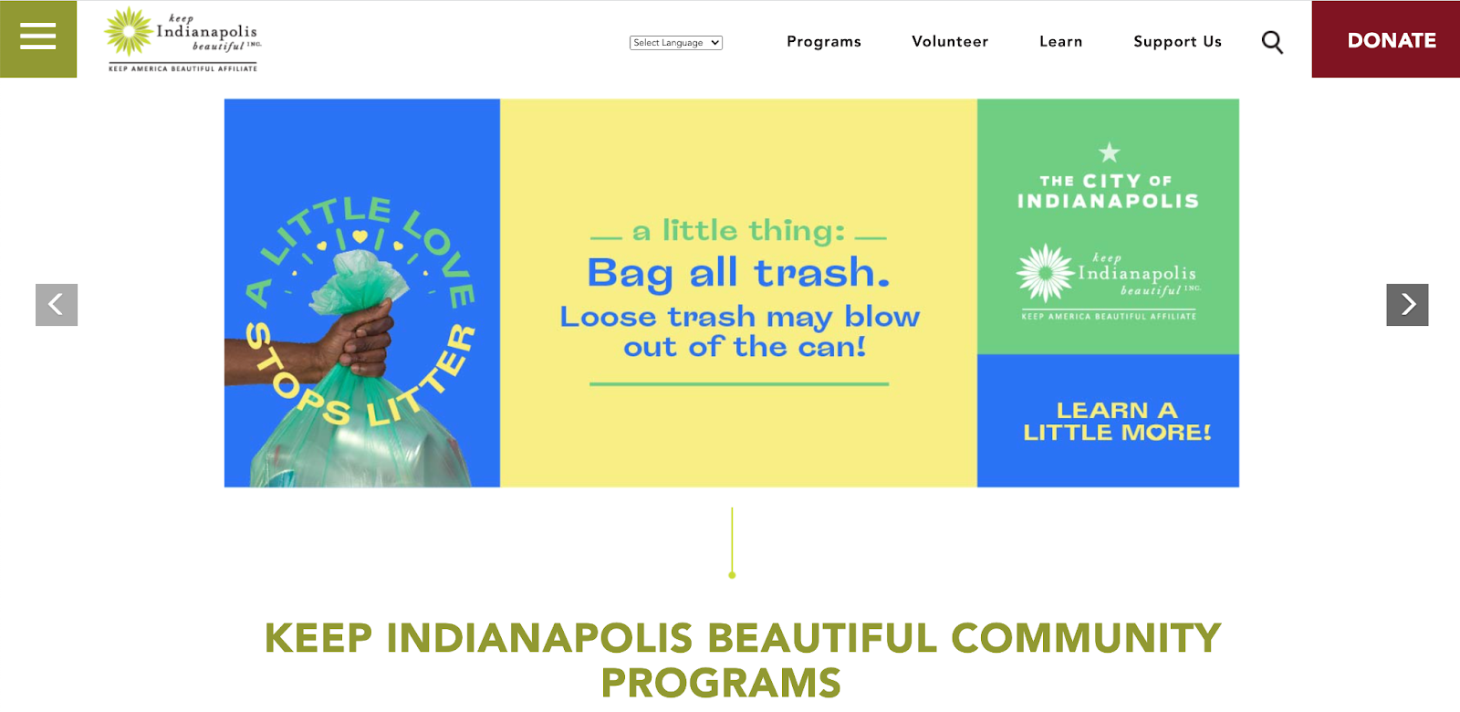
Shades of green and teal are frequent occurrences in nonprofit branding. The most obvious use of green is by organizations with environmental causes. “Going green” is a phrase often used to describe efforts to make more environmentally conscious choices. Because of this, many environmental organizations use green in their branding, like Keep Indianapolis Beautiful, whose logo includes two shades of green. Green often causes viewers to think of nature and the outdoors, so climate change organizations, community clean ups, and organizations related to wildlife or parks all use green in this way.
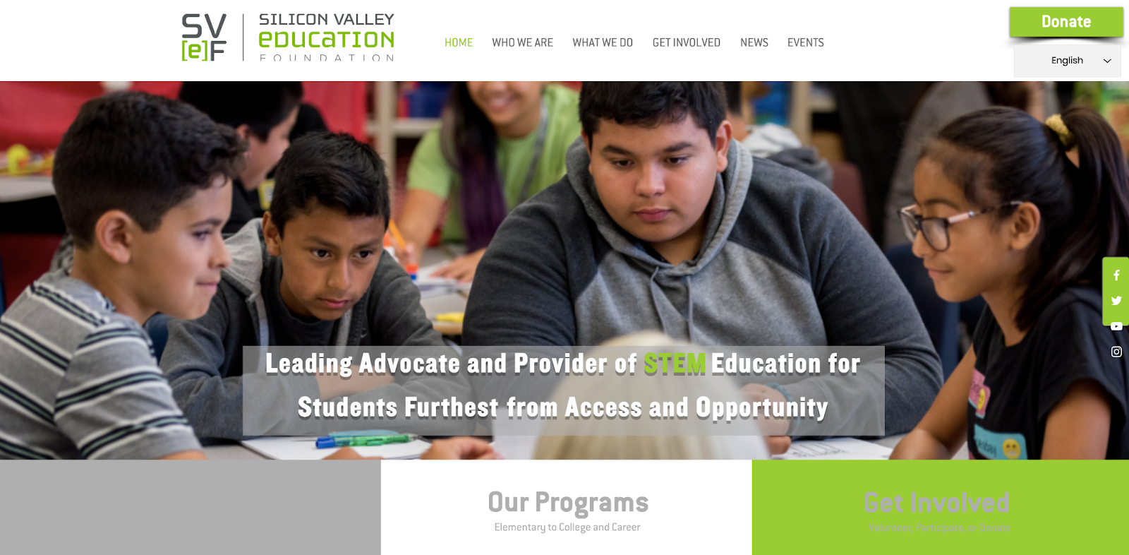
Charities with STEM (Science, Technology, Engineering & Math) causes also tend to use green or teal with regularity. Silicon Valley Education Foundation is a great example of a STEM organization that uses lime green to pop against their brand’s gray and white. Green used as the sole color amidst neutrals lends a modern look, appropriate for organizations handling technology and advancements in education.
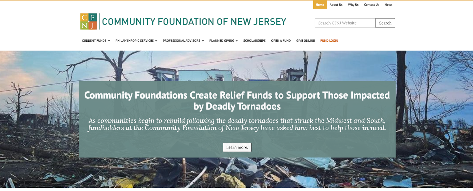
Foundations like Community Foundation of New Jersey use more distinguished, muted greens and teals. In the US, green being the color of money makes it an obvious choice for organizations whose mission involves providing funding to other nonprofit organizations.
Blue in Nonprofit Branding
Blue is one of the most frequently used colors in logos, websites and branding. Different shades of blue are often used depending on the cause, so let’s break it down from darkest navy to palest blues.
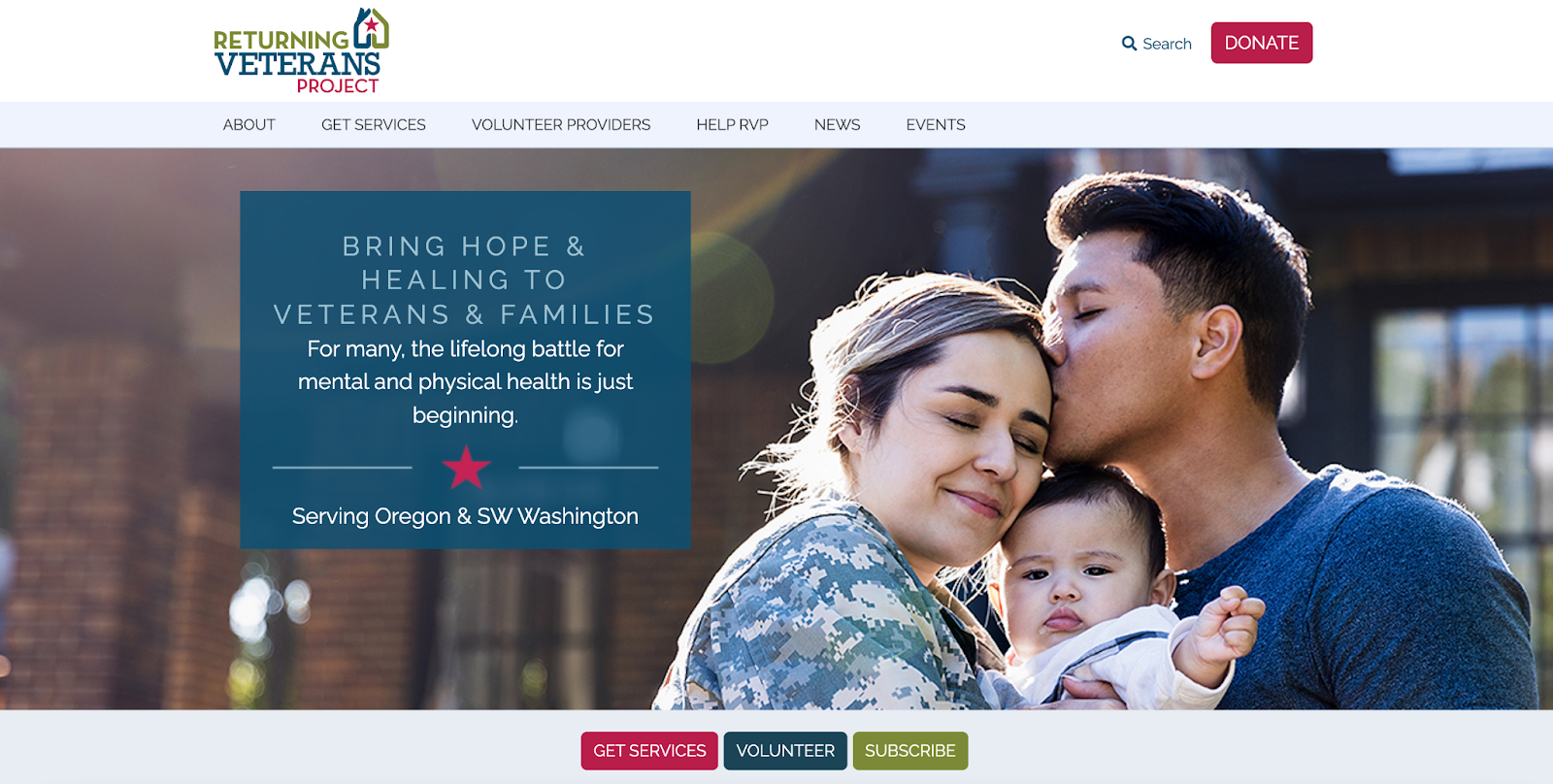
Deep, rich blues are often used by organizations that serve veterans, active military, or have a patriotic cause. Most of the time, these deep blues are paired with red to evoke images of the flag of the United States. Returning Veterans Project is a prime example of this. Deeper blues are often used as a secondary color to help ground brighter colors, making them more palatable to the average viewer.
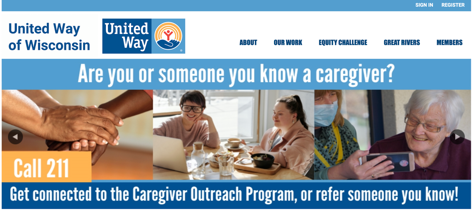
One of the largest groups of charities that uses blue branding are the United Way organizations. Across the country, the United Way uses two shades of blue in it’s brand, along with a pop of gold. When using two shades of the same color, be sure they’re different enough to create contrast. Two shades that look too similar lacks visual interest. Check out United Way of Wisconsin’s branding below to see how they use two shades of blue.
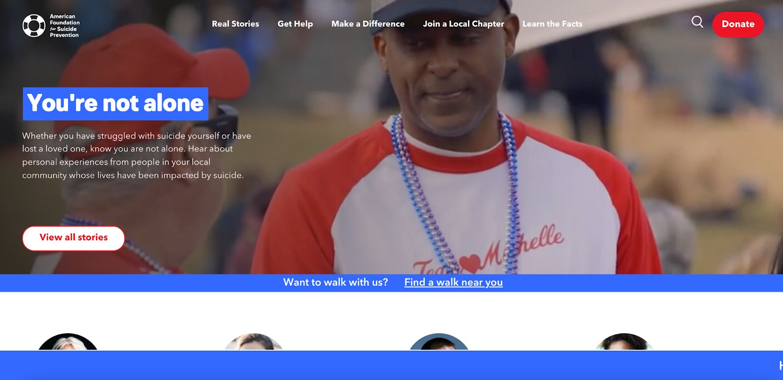
Bright blue paired with white can give a crisp, modern look to a variety of nonprofit organizations, from animal shelters to youth sports leagues. American Foundation of Suicide Prevention uses a bright royal blue in all their branding for a modern approach without making their materials inappropriately cheerful, as would be the case with a bright orange or pink. Bright blues can also be appropriate for organizations serving oceans or other bodies of water, as well as water sports nonprofits. Sometimes, organizations that are located near a shore or body of water will use blue in their branding, even if their cause is unrelated.
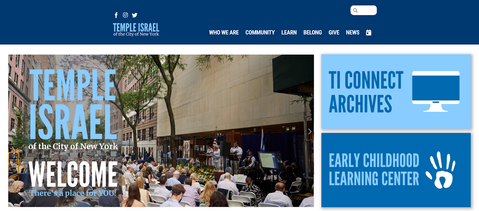
Some religious organizations use mid-tone or light blues as a symbol of peace and tranquility. Temple Israel of the City of New York uses a light blue along with a deeper blue to this effect. Some organizations serving mental health causes or crisis intervention also use blues as a symbol of calmness.
Purple in Nonprofit Branding
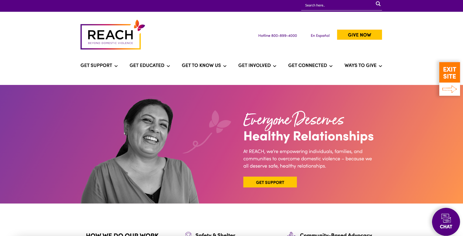
Similar to pink, purple is often used in causes related to women or girls. Domestic Violence awareness groups, prevention programs, and services for survivors often use purple in their brands. REACH uses purple in a gradient with pink and orange to use the color of the cause while still standing out from the crowd. Bright purples are often used by organizations serving girls and teens, while deeper hues are often associated with causes for adult women.
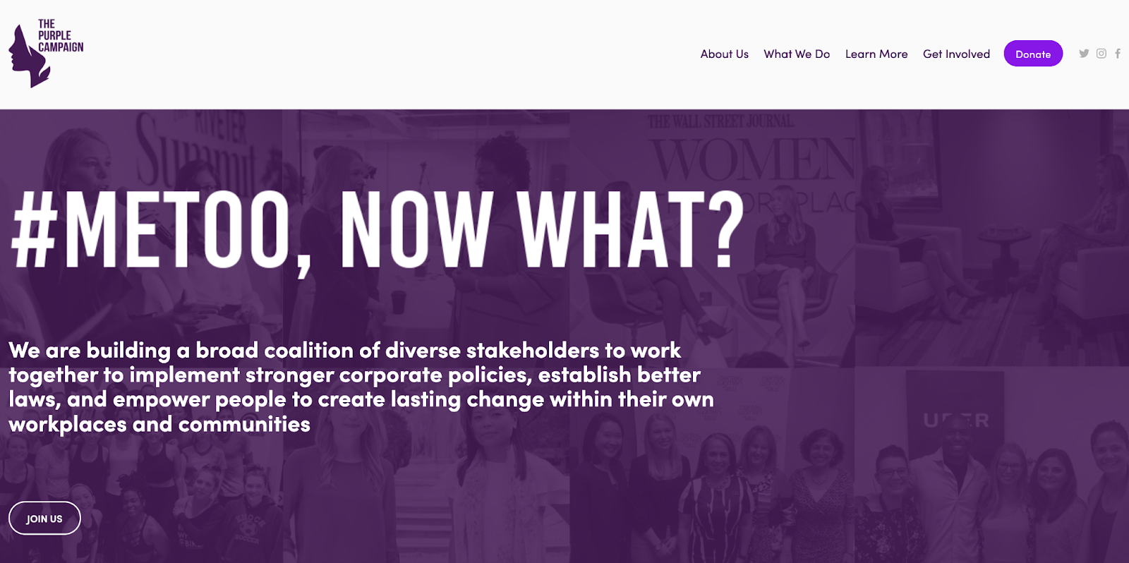
The Purple Campaign uses a darker purple, as they tackle addressing workplace harassment after the #MeToo movement. Dark, rich purples can also be used to instill a sense of royalty or dignity to a cause. Some churches use deep purples in this way, especially churches with royal words in their name like “King” or “Prince”.
Nonprofit Brands that Stick to Neutrals Only
Within the last 15 years, there have been more nonprofits that go with a completely neutral color palette– meaning they use only black, white, and/or gray in their logo and branding. When done well, this look can be timeless, clean and professional, though when done incorrectly, it can come off as harsh or boring. For the purposes of this piece, we’ll examine nonprofits that use this technique for a purpose.
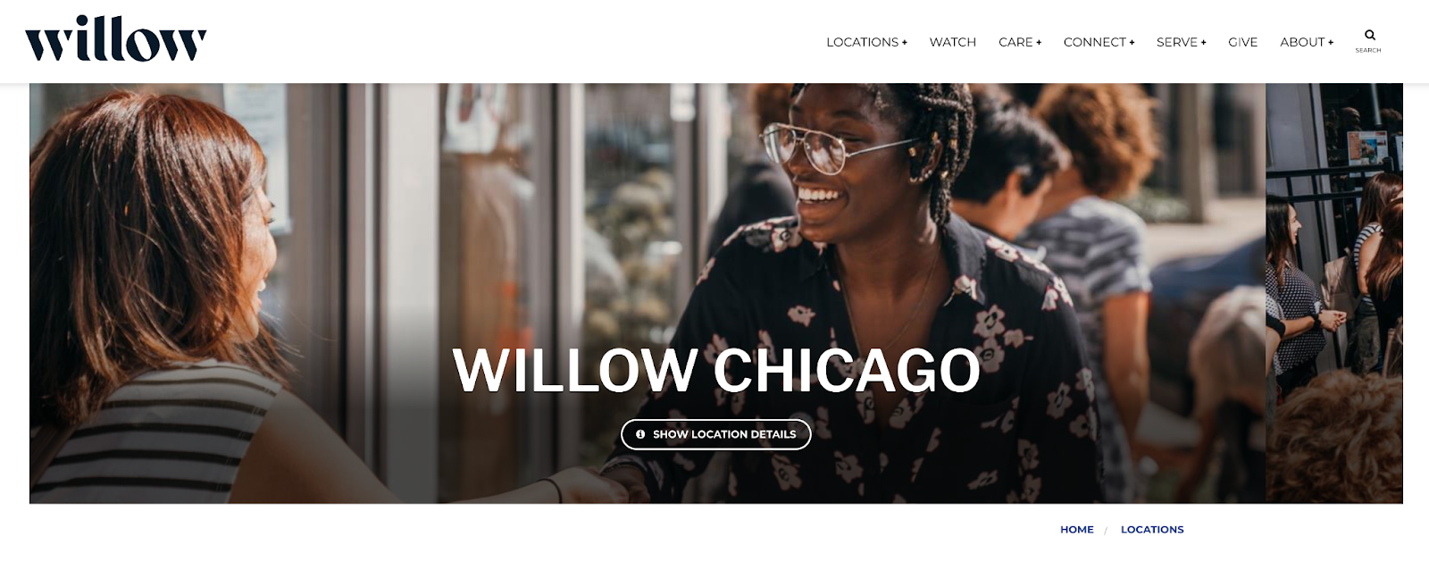
Using only neutrals has become increasingly common for churches that want a clean, modern look. Willow, a church with multiple locations in Illinois, is one example of this. For places of worship, using black and white in your branding has a few advantages. Many churches want flexibility in their branding because they offer different programs to different groups, like a church offering different ministries– from children’s programs to outreach ministries in their community. Because their one nonprofit doesn’t just have one key audience, neutral branding gives them the flexibility. For example, a white logo may appear on a black flyer for a ministry for grieving people in a community, but that same white logo can also be placed on a cheerful, colorful background for a youth group social media post.
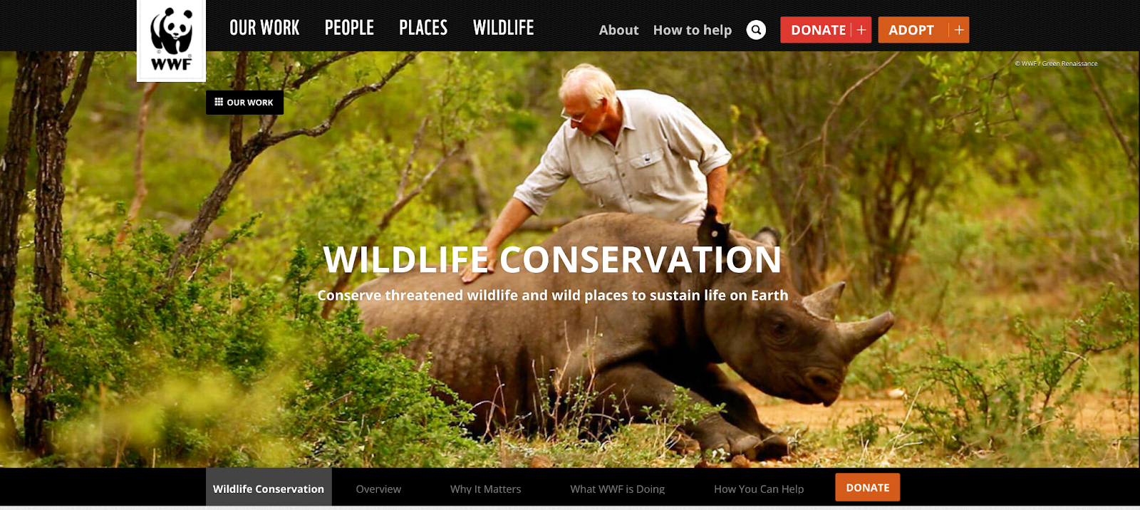
Using all neutrals can also simplify a more complex logo, making it more easily recognizable. World Wildlife Fund’s black and white panda logo is one of the most well-known logos in the nonprofit space. And again, because they offer a variety of programs, the black and white branding makes it easier for them to use it throughout different programs, so it’s not too tailored to only one service they provide.
Regardless of what your brand colors are, we always recommend having a white version of your logo. White logos can be used on most color or photo backgrounds, so they’re very versatile.
Other Things to Keep in Mind When Choosing Brand Colors
International Implications
If your nonprofit is handling matters internationally, it’s crucial to see if your brand colors have alternate meaning in countries you’ll work in. For example, white is used at weddings in the United States, but is viewed as a mourning color in Hindu culture. Being culturally aware of the implications of your brand colors can be important in determining how people in that culture will view your nonprofit. Do your research for each country you’ll be working in to ensure you don’t have any cultural misunderstandings. Branding sends a message about your nonprofit and your mission, so be sure you’re sending the right message.
Similar Nonprofits in Your Area
If there are nonprofits that serve the same population, area, or cause that you do, be sure to research the colors those organizations use. You wouldn’t want to choose the exact same colors as a similar organization, as it would increase the likelihood that people get your organizations mixed up. Your nonprofit’s colors should be appropriate for your cause and also stand out as distinct from other charities in your area.
Trends Come and Go
Picking a trendy color can be tempting, but your nonprofit’s brand should outlast 1-5 year trends. Make sure your brand has staying power by selecting colors based on your mission, not your personal preferences. You wouldn’t want your logo to go out of style and need a rebrand in a year or two. A great brand might not need a rebrand or an update for 10-20 years, potentially longer if the brand has name recognition or a timeless quality.
Conclusion
Choosing the right colors for your nonprofit’s brand is crucial. Make sure you have a trusted ally in your corner. Contact us today for a consultation with one of our marketers. We’re happy to help with selecting brand colors, creating logos & graphics, designing websites, and more!