At the most basic level, a logo is a symbol or design of a word or phrase that identifies your nonprofit. But a great logo is much more than that. A visually striking and memorable logo can create a sense of credibility between your nonprofit and potential volunteers, advocates and donors. And a bad logo can be damaging to your nonprofit’s reputation and even its funding in extreme cases. Your nonprofit’s logo is the symbol of what your organization stands for and serves as an introduction to people who don’t know about your organization. And as everyone knows, first impressions count!
Whether your nonprofit is looking to rebrand an existing logo or create one for the first time, it can be overwhelming to know where to begin. That’s why we suggest exploring examples of the 7 most common types of logos—so you can narrow your focus to a few visual elements you like.
Before we jump into the 7 types and examples of nonprofits that use them, here are some questions to consider as you brainstorm with your team.
What colors do we want to incorporate into our design? Your organization may already have a set of brand colors, but if it doesn’t, this is an excellent place to begin setting the tone for your logo’s look. Colors have a “language,” and in the nonprofit space, there are plenty of common themes that appear again and again. Learn more about choosing colors for your logo and see examples here.
What is our nonprofit’s “personality?” A big component of nonprofit branding is finding the organization’s voice. Your nonprofit’s brand voice is all about the words you use, while the tone is how you use those words depending on the circumstance of the message. Is your nonprofit sassy? Encouraging? Urgent? You’ll want your nonprofit’s logo to fit the feel of your voice—after all, would you want your logo to look corporate and formal if your nonprofit’s mission is to entertain children in hospitals?
What other visual elements do you want to include? Say you’re a Texas nonprofit that rescues abused animals and nurses them back to health. It would make sense for your logo to incorporate its name, some animals, a symbol that represents veterinary help or safety, or maybe even the shape of your state. But all of these elements at once? Probably not! If your logo has an abundance of words and phrases, several images or icons, and/or uses too many colors, it may be time for a logo rebrand. You’ll want a logo that catches the eye at first glance and that looks appealing both in print and online. Another key tip to keep in mind: your logo appears all over the place in all different sizes. If you can’t tell what your logo is when it’s on a small phone screen, it’s time for a change.
What are similar organizations doing? Picture the logos of nonprofit organizations you’d consider a household name, as well as nonprofits that have similar goals that you do. Do you notice any common themes? Logos you like and don’t like? Make note of the nonprofit logos that inspire you (and check out the examples we provide in this article!) But of course, if there are similar organizations in your area, keep this in mind as well. You don’t want a logo that is so similar to another organization’s that the two nonprofits are mistaken for one another.
What ideas do you already have? When you chose your nonprofit’s name, you likely began with narrowing down your mission. Maybe you already have a mission statement that guides your organization’s goals and priorities. Now, as you brainstorm logo ideas, you’ll want to have the same mission-minded focus. Think about how you want your primary audiences (for example, donors, the people you serve, and volunteers) to perceive your nonprofit and its programs. What images come to mind? What feelings? Carry these ideas with you as you explore the 7 logo types.
The 7 Types of Logos and Nonprofit Examples
1 – Logo symbols
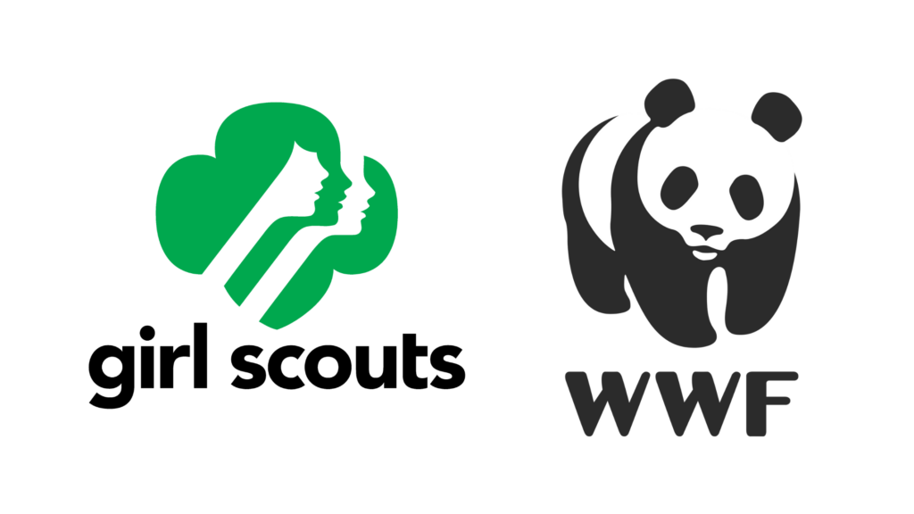
Logo symbols are what many people think of when imagining a logo. Also known as brand marks or pictorial marks, logo symbols are graphic icons, symbols or pictures that give viewers a mental image of what your nonprofit does or believes. Logo symbols almost always use imagery from the real world. We picked some extremely familiar logo symbols (Girl Scouts and World Wildlife Fund) for this article to illustrate how recognizable a logo symbol can be. While it can be a challenge for new or smaller nonprofits to have the same impact with their logo, that isn’t to say a logo symbol can’t be done. The most important thing you’ll want to keep in mind is that simplicity, originality, and memorability are the key elements to a powerful logo symbol.
2 – Wordmarks/Logotypes
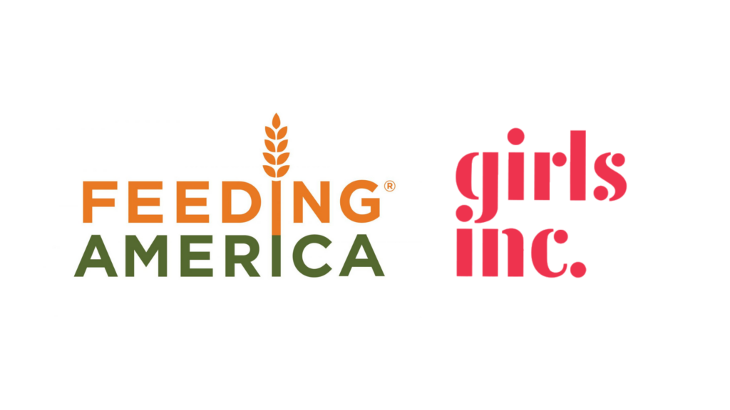
Wordmarks/logotypes are pretty straightforward—they’re your nonprofit’s name, designed with a distinct (but still readable!) font. Whether the typeface is custom-made or an existing font, you’ll want to decide if your name will have the first letters of each word capitalized, displayed capitalized, or all lowercase (like girls inc. did). This type of logo works great if you have a short, catchy name, but may not be ideal if it’s especially long. You might even want to add a few small embellishments, like Feeding America did with the stalk of wheat. An excellent wordmark logo communicates your nonprofit’s mission and values through a font selection that matches your brand voice.
3 – Badge Logos / Emblems
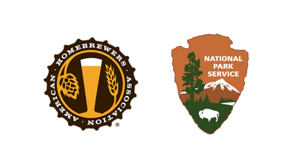
Badge or emblem logos look just like they sound – like a badge, crest, patch or shield. While this type of logo is most popular with private schools and universities, a badge logo may be just what your nonprofit needs if you’re going for an official look or want to invoke a sense of solidarity. Both of these logos for American Homebrewers Association and the National Park Service are great examples of nonprofits with badge or emblem logos. A great badge logo will have a straightforward shape, a simple color scheme, and a few simple visuals that represent what your organization stands for.
4 – Abstract Logos
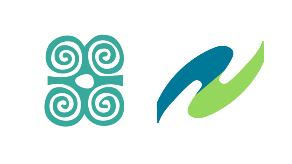
While logo symbols depict something recognizable from the real world, abstract logos rely on shapes that evoke a vague feeling or visual interest instead. A swoosh, blob, gradient or warped/deconstructed object may serve well in an abstract logo. Check out the swirls in the Young Center for Immigrant Children’s Rights’ logo, or the curved swoosh in Fiscal Sponsorship Allies’ logo. A strong abstract logo will be identifiable at first glance and incorporate colors that match your organization’s brand voice.
5 – Monogram Logos
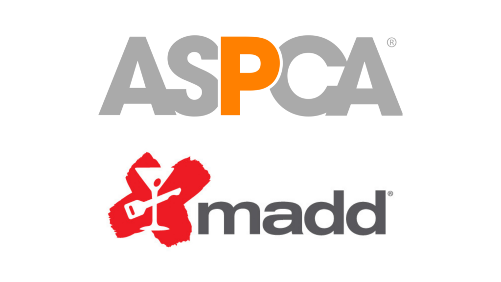
Monogram (or, lettermark) logos consist primarily of the organization’s initials. Since lots of nonprofits go by acronyms, this type of logo is appealing for organizations with longer names. You’ll definitely want to consider this logo type if your organization usually refers to itself by its acronym anyway, like the American Society for the Prevention of Cruelty to Animals or Mothers Against Drunk Driving. Monogram logos that go above and beyond add some additional visual intrigue by choosing a striking color palette, a memorable yet readable font, or a simple icon alongside the letters.
6 – Mascots
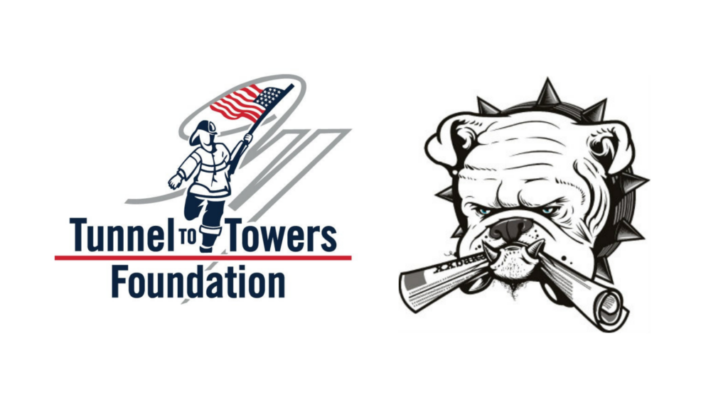
Mascot logos depict illustrations of people, animals or inanimate objects as characters that represent your brand. These mascots often differ from your typical icons or logo symbols due to their heightened detail, “personality,” and even voice. Mascot logos can provide a fun, engaging element to organizations’ brand identities, but they’re much rarer in the nonprofit space and often challenging to design. Mascot logos bear the risk of looking cheesy or unprofessional depending on the type of organization in question, so you’ll want to make sure a mascot makes sense for your mission if you’re considering this type. A strong mascot logo evokes a mental image or emotion that helps viewers relate to your nonprofit and its brand voice, like Tunnel to Towers Foundations’ firefighter mascot or Florida Bulldog’s dog with a newspaper.
7 – Letterforms
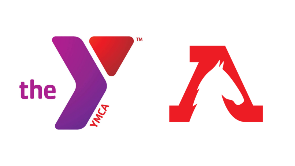
Letterform logos are small and simple to incorporate anywhere because they’re only the first letter of your nonprofit’s name. They look great on social media posts and are easy to recognize no matter where they’re placed. However, generally, you’ll want your nonprofit to be more established before switching to a letterform logo, so people can identify who you are and know your full name. Recently, the YMCA rebranded as “The Y.” Meanwhile, the American Wild Horse Campaign’s logo is only the striking red “A.” The best letterform logos are simple yet thoughtfully designed, like how the YMCA logo has two colors and a gradient, while the American Wild Horse Campaign has the outline of a horse in the white space.
Final Thoughts about Nonprofit Logos
Some nonprofits will have a combination of logo styles. Some may appear as a letterform logo in some areas and a wordmark elsewhere. Some may change its colors regularly as part of a dynamic branding plan. The possibilities are truly endless, and what matters most is what suits your nonprofit’s mission and key audiences.
Why work with a professional when creating your nonprofit’s logo or update a new one? A strong logo can build credibility, instill pride, and attract funders and volunteers, while a poorly designed logo can have the opposite effect. Worst-case scenario, logos that are too busy, use unappealing colors, or don’t suit the message you’re looking to communicate cause audiences to lose trust in your nonprofit’s ability to truly make a difference.
No matter what logo style you choose, you’ll want a talented designer to bring it to life. Let us know if you need help brainstorming or creating a logo that makes your nonprofit stand out.